A few years ago I had the pleasure of working with Diana at a London web agency in Shoreditch and loved the kind of web design she was putting out during that time. Several years later I was looking for a designer to fill in for a couple of months and I reached out to Diana again, and as luck would have it, she took me up on the offer and I was able to work with her again for another couple of months.
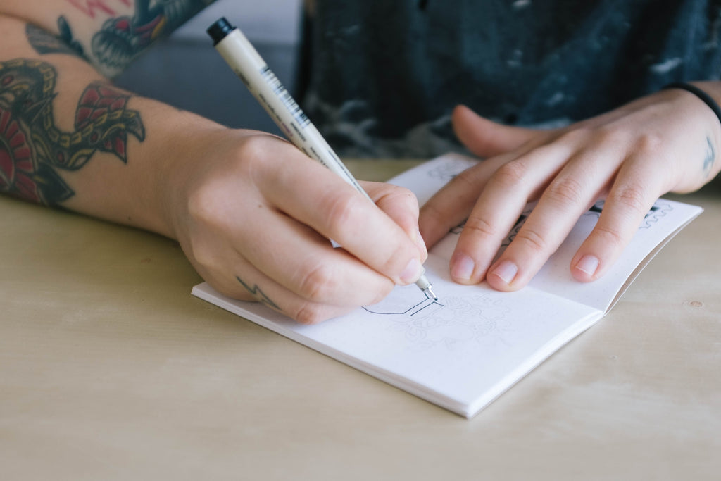
During that latest stint, I noticed Diana was doodling between jobs and I was impressed with the designs that were coming from the end of the pen. I asked Diana if she would trial our Kraft Pocket Notebooks and put them through the paces, answer a few questions and showcase some of the art she was doing in the notebooks.
She, of course, said yes and I'm super excited to showcase the interview and work with everyone. Let's hear what she has to say and then check out some of her gorgeous work.
Hello Diana, and thank you so much for trialing our pocket notebooks. Before I get to your creative process could you share a little bit of history about yourself? How did you get into design — and what was your background?
Ever since I was a kid I wanted to do something related to Art. From doodling on the living room walls to oil painting my formative years were filled with all sorts of creative endeavours. But the term “design” only came into my life a few months before applying to university.
After some research, I applied to a Design degree instead of going into Architecture. Fast forward a couple of years and a series of fortuitous events, I started interning at a big Advertising agency in Lisbon as a digital designer.
I still remember that I started was just when responsive design and parallax scrolling were the “next big thing”. Hah!
Where do you find inspiration for your design work?
Magazines. I love to hold and peruse a well design magazine, trying to figure out its grid, looking at typography and the way photography interacts with the written word. Long time favourite mags are Monocle, Cereal and Suitcase.
When inspiration strikes do you have a particular workflow that takes it from idea/concept phase and right the way through to a finished piece?
It always needs to start on paper. Even if it’s just a quick scamp to get a clear idea of what needs to go on the page. Then it’s grid building, pixel pushing and iteration, iteration, iteration. In parallel to high fidelity prototypes, I’ll start to build style sheets and other important documentation for developers.
When you're exploring ideas do you have a set of tools that you always reach for? Paper, Pencils, Pens, software etc etc
Paper and pens for sure! I have heaps of fancy pens, some of them are probably all dried out…
Before you go if you were to go back to your younger creative self what would the one piece of advice be?
Don’t focus too much on finding a distinct style. It’s overrated.
Thanks for your time Diana. If anyone is interested in continuing the conversation how do they get in touch with you or see more of your work?
For work either check Dribbble or my portfolio. And I’m also on Twitter @define_gravity. Thank you :)


I also Diana what she thought about the notebooks prior to getting these images and the interview — here's what she thinks:
I've doodled a bit but not as much as I'd want to, however, the initial feedback is very positive. The paper is really good and there's no bleeding when I use Sakura Pigma Micron pens. Haven't tried with more heavy duty ones like Poscas or Sharpies but I'm sure it will be the same.
It's always great to get feedback like this because our choice of paper stock means that the notebooks are slightly more expensive than the popular brands, but we like to think that if you take your notebooking seriously you're more interested in the quality.
If you want to work on the same pocket notebooks as Diana then go and pick up your own set of Kraft Plain Notebooks and show us what you can do.

Leave a comment: