
At the moment I'm currently enjoying some study that doesn't follow my online activity or the design/printing work I've been working on with these notebooks. Every Tuesday night I'm heading to the Greenwich Observatory to take part in an Introduction to Astrophysics. It's an 8 week course that starts with the Solar System before slowly moving outwards to the entire universe.
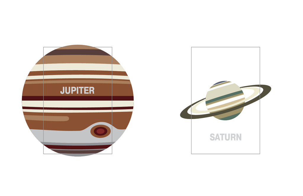
I started looking into the planets in our Solar System closer, it even spawned a new side project website at http://theuniverse.is. For this I was gathering some relevant information about each planet including it's diameter, mass, average distance from the sun, the day and year length, average surface temperature, it's inclination (what angle it spins on), satellites (moons) and more.
It got me thinking that this was pretty interesting information and could follow in the same approach as the RWD Notebooks by having technical information about each planet and some interesting facts on the inside of the cover.
NASA Technical Information
I started looking for a suitable typeface for the details and during my research I came across a report from Nasa, On the typography of flight-deck documentation, which goes into detail about how to make flight manuals easier to read.
The documentation goes in to detail about
- Typeface
- Lower-case vs Upper-case
- Font height
- Stroke wedith
- Horizontal & Vertical spacing
- Linelength
- Font-Face
- Contrast and color coding
It's a great read and provides you with the following overall recommendations:
- Sans-serif fonts are usually more legible than fonts with serifs.
- Avoid using a font that has characters that are too similar to one another, as this will reduce the legibility of the print.
- Avoid using dot matrix print for critical flight-deck documentation.
- Long chunks of text should be set in lower case.
- If upper case is required, the first letter of the word should be made larger in order to enhance the legibility of the word. (3.3)
- When specifying font height, or accessing graphs to determine the size of a lower-case character, the distinction between "x" height and overall size should be made.
- As a general recommendation, the "x" height of a font used for important flight-deck documentation should not be below 0.10 inch.
- The recommended height-to-width ratio of a font that is viewed in front of the observer is 5:3.
- The vertical spacing between lines should not be smaller than 25- 33% of the overall size of the font.
- The horizontal spacing between characters should be 25% of the overall size and not less than one stroke width.
- Avoid using long strings of text set in italics.
- Use primarily one or two typefaces or emphasis.
- Use black characters over a white background for most cockpit documentation.
- Avoid using white characters over a black background in normal line operations. However,if this is desired:
- Use minimum amount of text.
- Use relatively large type size.
- Use sans-serif to minimize the loss of legibility.
- Black over white or yellow are recommended for cockpit documentation.
- Avoid using black over dark red,green,and blue.
- Use anti-glare plastic to laminate documents.
- Ensure that the quality of the print and the paper is well above normal standards. Poor quality of the print will effect legibility and readability.
- The designer must assess the age groups of the pilots that will be using the documentation,and take a very conservative approach in assessing information obtained from graphs and data books.
So with all of this knowledge I'm going to run with Palatino and Gill Medium as the typeface, CAPS for the titles and descriptions.
Leave a comment: